Workshop by Bas Jacobs
The type workshop by Bas Jacobs was essential in my main project of this unit. I attended the workshop expecting to learn how to make a font and publish it. I did learn how to make a working font, well, at least at a beginner level at least. But I took away something important and new from the workshop which I did not have a clearer understanding of earlier. The workshop began with a few slides about type design. Then we were given a task to create an image using any object, which we were told to make abstract in its form to change its meaning and understanding. I picked up one of the chairs in the classroom to draw and in stages of 3, tried to make the image more abstract. This helped me understand variations in abstraction and ways to control it to degrees by which the image could change its meaning.
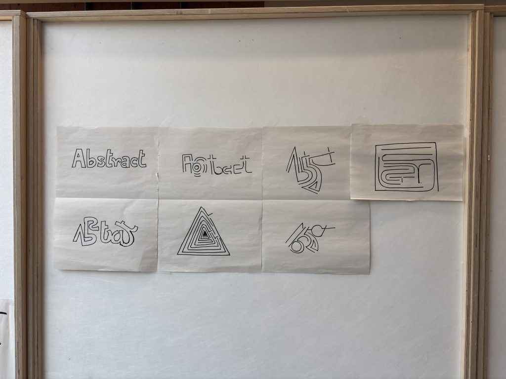
I later experimented with typography and carried out the same process. I picked the word ‘abstract’ and tweaked the letters to create a step into making it more abstract. I took the letters and placed them in different ways, devising different ways to write and read. The word became unreadable the more abstract it became.
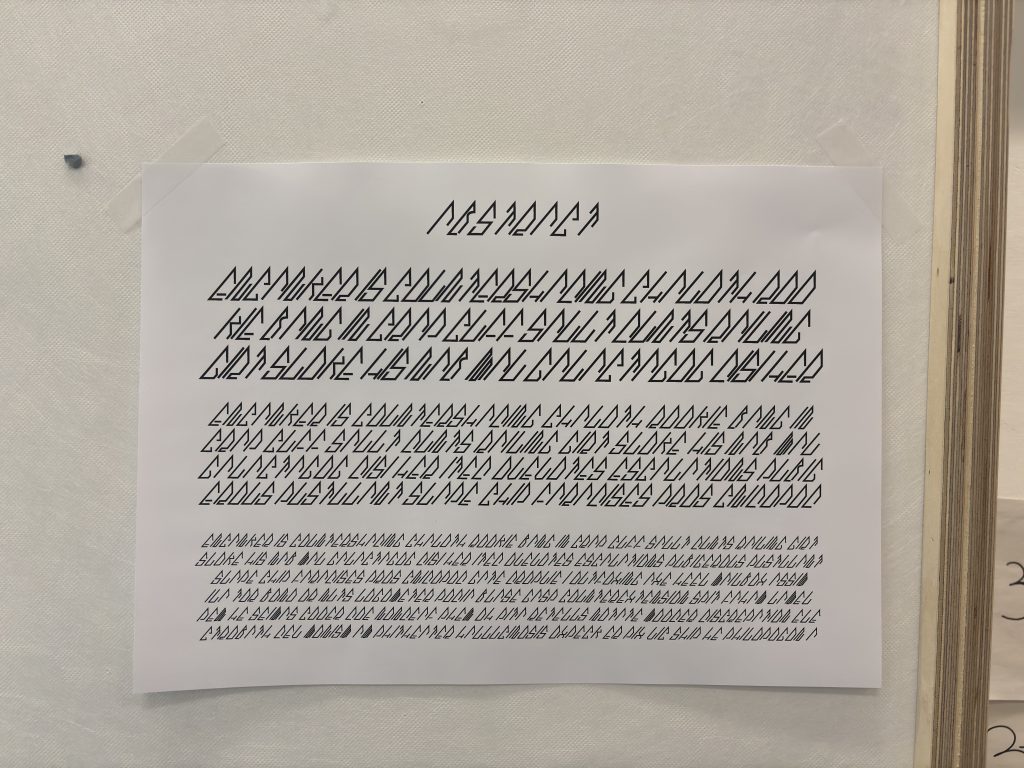
The final leg of the project was learning Glyphs and using the forms explored previously to create a working font, which in this case, was to be made readable. I created a grid with one of the letterforms and made the letters of the english alphabet to create a font which looked very sharp and angular.
The understanding of abstraction and to be able to control levels of it deemed to be very useful to me. I used this new knowledge in my studio practice and felt that I could better navigate my way through tweaking letterforms to create a wider gap between comprehension and confusion. I believe, with time, practicing this method will help to create more nuanced iterations in my project.
Leave a Reply