Bibliography 2
Annotated Bibliography
The annotated references below are in no particular order.
- Lucy Bourton, It’s Nice that (2018) Experimental designer Felix Salut launches typographic Galapagos Game.
Available here: https://www.itsnicethat.com/news/felix-salut-galapagos-game-graphic-design-271118
The Galapagos game is an open system, made up of 9 building blocks with geometric shapes that can be arranged in a two or three dimensional way and works as a tool to draw letter shapes. This typeface, created by Dinamo typefaces, collaborating with designer Felix Salut, is inspired by this aspect of the game and was launched alongside an app. It mimics the game digitally by creating different combinations. This approach is modular and uses shapes combined in different formats to create letterforms, this results in letterforms that have a distinct visual feel. I think this process of using a set of shapes to create distinct letterforms can be a way to make obscure typography which can be harder to read at a glance as well as typesetting and looking into how we humans read a piece of text are areas that can be explored further. - Xiaoyuan Gao, Notyourtypefoundry
Available here: https://www.notyourtype.nl/tools/
This is a small, independent type foundry based in Rotterdam, in the Netherlands. It houses a collection of typefaces designed by various creators, by using tools of designing type that are beyond the conventional tools, softwares. This website also contains links to online design tools, interesting projects and archives as well. It started as a playground for Xiaoyuan Gao for experimental type design projects and developed into a practice for sharing different ways of making and thinking about type and type design. There are many ways to visualise type and make letters. For example, one of the typefaces featured here is called ‘kitchen set’, which has letters made out of kitchen tools, a good example of pareidolia in existence! - Emil Kozole, Project Seen
Available here: https://projectseen.com/
Project Seen “is a typeface that is concerned with privacy and the interception of our communications by the NSA. It automatically strikes through “spook words” as they are written“.
Seen was developed by Emil Kozole as a way to create awareness about surveillance of our communications by the NSA (National Security Agency from U.S). They identify certain sensitive words and use them to scan through documents. The typeface can be used in any design softwares, word processors or in a browser. The font can be used to write normally as text and the trigger words get crossed out automatically. This highlights were one is potentially prone to being surveilled while also preventing one from potentially being tracked. It is an experiment of evasive and reflexive techniques around the topic of online privacy. - Colin Marshall, Open Culture (2018) The Hobo Code: An Introduction to the Hieroglyphic Language of Early 1900s Train-Hoppers
Available here: https://www.openculture.com/2018/08/hobo-code-introduction-hieroglyphic-language-early-1900s-train-hoppers.html
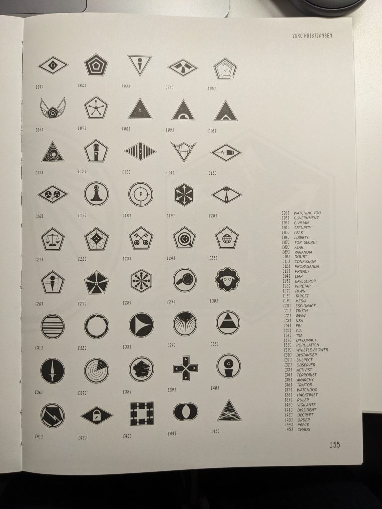
Although there is no clear evidence that these elaborate signs were used as a legitimate mode of communication, these ‘codes’ have been seen and recorded as a possible way for these individuals to communicate messages with each other. The ‘hobo code’ is similar to a hieroglyphic language, where pictures drawn using shapes signify specific words or phrases. It was a way for these individuals to communicate about work, meals, directions, resources or policing and other important messages in different areas to other individuals traversing the same path. These codes could be seen written on brick walls, bases of water towers, outside houses or any other surfaces that didn’t move. They also used monikers on trains, walls and elsewhere as a way to signify they had been there. I think humans have communicated in similar secretive codes that can only be understood by a group of people to pass important messages to each other and also escape the eyes of other people, sometimes the government and people who impact their lives in a negative manner, even if proof of such communication is not legitimate and recorded and it can be a mythology used by the Hobo community and tales, the possibility of such a method of communication and the stories surrounding the community do work well as inspiration in my work. - Yoko Kristiansen, 45 Symbols / Clay to Code, Slanted Publishers (2016), Seeing and being seen in a post-privacy world.
The author of this work, Yoko Kristiansen raises the concerns surrounding surveillance of the public by authorities and governments. He asks the question that does intense surveillance really solve the problem of crime. Rightfully, what happens when powerful technology falls into the hands of those who would use it against the people its supposed to protect?
The project’s context is set in a future where surveillance exists to the point where privacy is not a right anymore and there is nothing to hide. The symbols created in this project are designed to resemble badges that can be worn to convey a person’s identity.
He imagines a future where these badges could describe one’s state of mind accurately. How would we exist in a society where our deepest feelings and emotions are communicated in front of everyone non-verbally at all times.
Leave a Reply