Positions through iterating
Bibliography
- Stuart Bertolotti Bailey (2007), ‘Towards a critical faculty’
“We no longer have any desire for design that is driven by need. Something less prestigious than a “designed” object can do the same thing for less money. The Porsche Cayenne brings you home, but any car will do the same thing, certainly less expensively and probably just as quickly. But who remembers the first book, the first table, the first house, the first airplane? All these inventions went through a prototype phase, to a more or less fully developed model, which subsequently became design. Invention and the design represent different stages of a technological development, but unfortunately, these concepts are being confused with one another.”
The quote above says that we no longer have desire for design that is necessity driven. The argument is that functionality overshadows aesthetics. I think it resonates greatly with my inquiry. Maybe we have become so fixated on efficiency and affordability that we have lost sight of artistry & expression in the process of design. The cost of standardisation is compromising the uniqueness of human identity. This standardisation of typography in the digital age where practicality often trumps unique expression, just as Bailey talks about invention and its relation to design, the forgettability of mundane objects, I wonder if our reliance on standardised digital typography is creating a homogenous visual landscape, sacrificing the potential for more expressive and individualised communication.
2. Michael Rock (1996), ‘Designer as Author’
Authorship may suggest new approaches to understanding design process in a profession traditionally associated more with the communication than the origination of messages. But theories of authorship may also serve as legitimising strategies, and authorial aspirations may actually end up reinforcing certain conservative notions of design production and subjectivity — ideas that run counter to recent critical attempts to overthrow the perception of design based on individual brilliance.
The paragraph mentioned above talks about design processes in a broader sense as being associated more with communication more than origination of message, or expression. In the context of human expression in this day and age, design processes/ tools are standardised elements. Typography in the digital age is standardised by fonts and layouts. Though designers can create meaning & expression even within these constraints through font choices, spacing, hierarchy, etc., This compels us to reconsider the nature of authorship and creativity in a digital world. This questions the role the author has in design, typography, expression in today’s world, in a world which is mechanised and automated in every facet.
3. Rick Poynor (2010) ‘Rethinking conceptual type design’
“In conceptual type, the underlying idea is the most important factor even at the expense of legibility.”
This specific statement stands out to me in the context of my inquiry. Through the iterations I produced during creating the iterations of the text :open door, I made letterforms and lockups that often looked illegible from a communicative point of view. When it comes to conceptual art, in this case, typography, the underlying idea or thought would carry more value than the communication aspect of it. Communication might not be the primary objective of the type or design, but maybe the intent, idea behind a given iteration can be the purpose of a given design or form. I think that this gives the designer an opportunity to explore the areas of abstraction and expression and not stay limited by the functionality of design.
4. Nejc Prah (2021) ‘Crack Up, Crack Down’
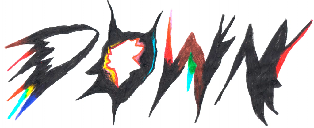
The selection behind this reference is in related to my method of iterations in the initial stages. I explored typography by drawing them on paper. Without any grids and compositions, I went ahead and drew letterforms with the same text repeatedly, using only a black coloured pen/ brush to create the type & letters. The iterations are about expressing the standardised segmented typography as seen on interfaces in different ways, but with a few constraints in the medium of expression. The iterations happened in the letterforms and arrangement of the type. The hand-drawn aspect of this reference is interesting, the forms are drawn in a free-form manner and not rigid by structure, although the letters are cohesive and belong together, I also like how different colours are used as accents within the forms in different areas.
5. Camile S Bouyer (2024) ‘Am I your type? Designing conceptual typography’
“Another approach is to explore concepts through the design of the type itself, breaking free from the traditional rules of typography and experimenting with new shapes and structures.”
By exploring typography in concepts through the design of the type itself, we can look at typography in a different light, not for serving the purpose of communication and within traditional structures and systems, the exploration of concepts can be about the type design itself. It can be about expression and idea behind the design that outweighs the functional and communication aspect of it. This helps us to escape from the mundane and functional aspect of typography. By focusing on experimenting with forms and design of the type itself, we connect more with the personal approach and visual expression of typography and design. This also creates space for more diversity and distinct identities for us as designers and human beings through our expression.
6. It’s Nice That (2025) ‘Artist Anna Lucia is working at the intersection of craft and computation’
Anna Lucia works with the interaction of code and textiles. She says her work falls in the intersection of technology and craft. I can relate this to my inquiry on typography and human expression in the digital landscape in a similar way. I think the iterations I created starting with the typography from a digital interface and attempting to create variations of it by re-drawing it to create hand-drawn iterations of it was a way to explore the shapes, also creating distinct forms in expression through type design. Its not exactly the same, in her work, the overlap of technology, structure, systems and randomness is more balanced, perhaps that is a possible route for me to explore in my project.
My line of inquiry :
How human expression translates across digital spaces in mediums like typography, which has been standardised through fonts and mechanical tools such as standardised displays and interfaces, which serve the purpose of communication and functionality. By critically looking at type design, I wish to understand its role in communication as well as a form of human expression. My inquiry started with the standard type forms seen on segmented displays such as watches and other similar interfaces. In these interfaces, type is purely used as a functional tool used for communication of data. This extrapolates into digital screens and interfaces that use fonts as tools of communication solely. I wonder how type can be used in interfaces and UI as not just communication tools, but also as expression.
Leave a Reply